new york

Sutton Renovation Close-up: My Little Office!

The first version of this post was originally posted in February 2012 on the giftable designs blog.


Because it isn’t just as easy as picking out a color and waiting for the “after” photos, I’m going to start outlining each room, the process of design and renovation, and finally what I would change (or wouldn’t) if given the chance. I’m going to upload a ton of pictures with little descriptions, but if you just want the final run-down (or the finished pictures!), scroll to the bottom.

This is kind of half-assed of me. I’m posting a close-up of a room that isn’t even a room. But it is a separate space, so it’s kind of like a room by NY standards. At least I’m not talking about the shower in my kitchen (I was actually over at a friend’s apartment recently who has a shower in her kitchen. If you’re reading this– sorry! No judgments πŸ™‚ ).

Since M and I both work from home, we wanted to each have our own office space. Back in Toronto, we bought a big desk and shared it, but since my space is always messy from crafting and his is always covered in paperwork, we decided to split off our offices into two spaces. I got the window side of the living room and he got the window side of the bedroom.

This is kind of what it looked like on paper:

As you can see, we divided up the space with furniture. My office is separated from the “living room” space with a wood credenza (aka liquor cabinet) and his by a huge Ikea Expedit bookshelf. This leaves slightly-larger-than-doorway-sized open spaces for us to “enter” our offices. Without this, I would spend my work day trying to catch a glimpse of the TV and he would roll over into bed around lunchtime.

I’m not going to go into renovation details. New floors, new AC units, new windows, new electric. Here’s a quick refresher:

before!

before, clean-ish.

After.

6 months of work in 3 images– how about that? Anyways, once we got moved in an unpacked about 80% of the boxes, I was finally able to SEE my office space again.

^I probably shouldn’t tell you how long we lived like this^

I put together the Ikea desk and the small Ikea Expedit bookshelf. I constructed some curtains (Ikea fabric. Do you see a trend?) and realized I had no space whatsoever for my yarn and fabric. Back to– guess where??– Ikea! 3 Billy bookcases and one week of hex keys and particleboard later, I have this:

ImageIsn’t she a beaut? I love her. The tops still need to be filled with tsotchkes– I can’t reach them without standing on a chair, so I didn’t want to put anything functional in there. I was finally able to start unpacking the rest of my office supplies, and later that week I had this:

Image

There are still some blank spaces on the wall to fill in, and I want to do some fun crafty things with the desk. But overall, I’m happy with where I am right now. It’s a great space to work in. And hey– I’m not using the kitchen counter as a desk… anymore…

Details:

β€’ Desk – Ikea… purchased years ago and no longer available.

β€’ Bookshelf – Combination of Billy bookshelves from Ikea with glass doors and height extention ~$300ish

β€’ Curtains – Ikea Monalis, $7/yd

β€’ Flower Pots –Ikea Kardemumma, $4-6 each

β€’ Egg chair – Ikea. Super old… they probably don’t make it anymore. And if they do, don’t buy it– least comfortable office chair ever.

β€’ Chalkboard Window – from Building Character in Lancaster, PA

β€’ Desk Lamp – Bird Branch Task Light from Pottery Barn Kids.

β€’ Art – bulletin board and “Chinchilla Ranch” sign are handmade by yours truly. Bunny etching from Oldie’s Marketplace in Newburyport, MA (antique), $12. “Make Do and Mend” sign from Urban Outfitters, $20

Sutton Renovation Close-up: Dressing Room

The first version of this post was originally posted in November 2011 on the giftable designs blog.


Because it isn’t just as easy as picking out a color and waiting for the “after” photos, I’m going to start outlining each room, the process of design and renovation, and finally what I would change (or wouldn’t) if given the chance. I’m going to upload a ton of pictures with little descriptions, but if you just want the final run-down (or the finished pictures!), scroll to the bottom.

Almost done with Close-Ups! Here is the second-to-last!


As the smallest room in the house, measuring just 24 square feet (on a good day), this room should have been the easiest. It’s basically jut a mini-hallway that links our living room, bedroom, and bathroom, and provides some space for linens. But since it’s so compact, it actually made my job a lot harder. You can get away with much stronger colors and motifs in small rooms without them looking shocking or getting old quickly. The first time we saw this room, it was just a spot for the previous owner to store tablecloths and doilies, but we knew we wanted to have more fun than that!


I knew immediately I wanted a star-shaped pendant light. I don’t know why– it may have been a bit of an obsession. But it had to happen. I tried to order one from Pottery Barn, but as soon as I settled on it, it sold out. So I bought an outdoor light from Macy’s. I thought of using Flavor Paper’s Starglint wallpaper, but I couldn’t tell if the reflective wallpaper plus strange light plus small room would equal awkward and overdone. I eventually decided on only one star-themed accessory per room, so the wallpaper was sadly out.

Next we were going to paint it red. Like a deep burgundy red. I was hesitant because I had a feeling it would feel like being inside someone’s body, but we bought the paint anyway.

And then, the night before the crew was supposed to paint, we were out at a speakeasy in Chinatown that was entirely black– walls, ceilings, couches, and floors. It finally hit me that this would look awesome. Somehow it’s more neutral than the dark red, but it still makes a statement, and it doesn’t matter if it’s dark because it’s not a room you linger in anyway. I came in the next morning with a new gallon of paint and the crew literally thought I’d lost my mind. They spent about 20 minutes trying to talk me out of it, but it’s my space so I won (and we could always paint over it later, anyway!)

The black paint (it’s actually a super dark gray) is absolutely perfect in the space. It isn’t too dark, it doesn’t make the room feel smaller, but it does make me feel cozy and like I finally proved my doubters wrong. Even the contractor was saying by the end that it was his favorite room.

The other major change we made was also a mid-renovation decision. The room came with super heavy sliding wood doors, and I knew as soon as I walked in that I wanted mirrors. The doors take up a whole wall of the room and mirrors would reflect light, make the room look larger, and help turn it from a hallway to a “dressing room” (which is what it says on the original floorplan for the apartment and was originally a total joke). I was planning on ordering those sliding mirror doors that everyone (including me) hates– the ones that fall off their track and look like they belong in a rental apartment from the 80’s. But I couldn’t find a nice version of the same thing.

Then when they took the doors off to repaint the interior of the closet, I realized how HUGE it looked. Being able to open up the whole thing at once turned it from a linen closet to a coat/laundry/linen/cleaning supplies/extra paint closet! Just compare the photos above– which would YOU prefer?? I did some research and found sliding mirrored bi-folds at Lowe’s. When they’re closed, it’s a wall of mirrors, but when they’re open you can access 90% of the closet without wedging your body in an awkward position.


I also had them install a light in the interior of the closet, just in case the star light ended up inadequate. I’m really glad I did because we end up using this room more than I thought we would, and the extra light makes the black paint less of a potential problem. We also installed a frosted glass door between the foyer and the dressing room, which lets in light and also makes cool shadow silhouettes.

So there you have it. One tiny room, some paint, a light fixture, and mirrored doors. The art on the wall is by Paul Nassar— a local artist and good friend. I mean, seriously. Does it get more perfect than that?


Room Details:

β€’ Light fixture – Marrakesh Star from Macy’s, $90

β€’ Paint – Behr UL260-23 Poppy Seed, eggshell finish

β€’ Frosted glass door – Custom order from Home Depot, $200

β€’ Mirrored sliding doors – Custom-made from Lowe’s, $250 (similar to these)

β€’ Art – custom housewarming gift by Paul Nassar

Things I’d Do Differently (or Keep the Same):

I wish I had wallpapered this room with a beige floral pattern and kept the standard issue 1953 bulb cover.

NOT.

I freaking love this room. It’s not for everyone, but it’s my apartment and so far everyone that’s come in has gasped at the awesomeness. There have also been comments about how there could be no more perfect spot for the flying pig painting, which is true.

We decided not to Elfa-out this closet, even though we did all the others. There are so many oddly placed soffits (vertical and horizontal), and the current layout actually works quite well. Once we got it properly lit, we had no desire to rip it out and start again. It also saved us a couple hundred bucks, which is nice.

Basically, the only problem is that the doors all knock into each other, but in a space this size that was never going to be avoidable. So far no major incidents between the bi-fold doors and the frosted glass pane, which is my major worry.

That’s all for now! Cheers!

ps. The living room Close-Up post won’t happen for quite awhile. It’s currently full of our remaining boxes and some furniture we found in the trash. Not in the chic, saving-an-antique way… but more in the freegan, dumpster-diving way. When we get around to finding some perfect permanent pieces, I’ll post about it πŸ™‚ In the meantime, we’ve made some life-changing decisions that involve a HOUSE HUNT. Like, a real house. With multiple bedrooms. I have never lived in one of these things before, so it should be exciting!

Sutton Renovation Close-up: Bedroom

The first version of this post was originally posted in August 2011 on the giftable designs blog.


Because it isn’t just as easy as picking out a color and waiting for the “after” photos, I’m going to start outlining each room, the process of design and renovation, and finally what I would change (or wouldn’t) if given the chance. I’m going to upload a ton of pictures with little descriptions, but if you just want the final run-down (or the finished pictures!), scroll to the bottom.

Room number three! Yay!

I think the bedroom may have been the easiest room for us to agree on from the start. We had been living in a 100+ year old tenement apartment for 3 years, and as much as I loved the character of the exposed brick, we were sick of having such warm colors in the bedroom (it’s not very relaxing!). We wanted the bedroom to be soothing and calm with a beach cottage vibe, and an edge. The one reference point we kept coming back to was our favorite hang-out, the Ale House Inn in Portsmouth, NH. Whenever we manage to get away from the city and up to the Seacoast, we love to just sit and relax in the tranquil and beautiful, yet modern hotel rooms. So basically, all the work has been done for us. All we needed was to find a beachy blue for the walls and inject our personal style into the details….

Blah, too much talking. Look… pictures!


We got the room cleared out, and then used it mostly for storage of the construction materials. We decided to have our crew refinish all the floors in the apartment, except these, because M likes wall-to-wall carpet in the bedroom. So, unlike the 100-step-process of all the other rooms, the bedroom only needed:

β€’ The walls sanded and painted.

β€’ Elfa components installed in both closets.

β€’ The electrical outlets grounded.

β€’ New moulding.

β€’ The whole shebang on the windows and A/C unit. (discussed below)

β€’ Carpet

The first thing they did was paint. You can see our original paint color below, on the right (on the wall with the windows). It was ok but felt like maybe we were preparing for a baby boy and not two twenty-somethings. We switched to the color you see on the left, which felt a lot more subdued and nautical.

We used the same taupe color for all the trim in the apartment, and went for a sunny yellow as the closet interior color. We wanted something that wasn’t white or beige, but wouldn’t dramatically alter the look of our clothing.

Next up was the PTAC! That’s a “packaged terminal air conditioner” for those who haven’t been speaking renovation for 8 months now. They’re the giant units you see in old hotels, and they’re required by our building. The first step was to open up a gaping hole in the side of the brick-and-concrete building.

Then comes a wall sleeve, an exterior grille, and finally the air conditioning unit and cover. They also realized halfway through that they had to switch out the regular 120v outlet for a monster 240v outlet (which delayed us a few days, since all the electric had already been done and the walls were all closed back up already).

We also had to move and cover the building’s heating coils. Although the PTAC serves as a heater, the building heat is free (or at least already paid for by our maintenance)– it’s also terribly ugly. First the building wanted the coils to be placed on the top of the unit, then the bottom, then the top. I’m still not convinced that it matters or that they know what they’re talking about.

And lastly, they had to install one large pane of glass where the old window and old A/C used to be. This made the room look about 16x bigger and brighter.

So here you have the room as complete as the construction crew would make it, but without functioning floors.

The next step was to get some carpet installed. This was a much bigger headache than we anticipated. Note: If you don’t care about carpet and/or don’t enjoy rants, just scroll on down.

Originally, we just stopped into good ol’ Home Depot. Obviously, their carpet isn’t the best quality I’m going to find in the whole city, but I figured it would be quick and cheap. And considering how much I care about carpet, that sounded about right. The people at the store were complete morons. One girl had a “I’m New!” button on her smock, and an older man who followed her around later admitted she was training him. Neither of them could figure out the computer system. Eventually, we got a quote of around $1100-1200 for our 200 sq ft room. We decided to go for it.

The guys came to measure and we were emailed a new quote. There were over $200 in hidden fees! There was a “Hard Access Walk Up Fee (For hard to maneuver staircases and landings) or elevator access“– a fee for elevator access?? They should give us a convenience discount for being in one of the few non-walk up buildings in Midtown! How can you charge someone $150 due to the fact that they have an elevator? You know what it is? A NYC surcharge. And that’s BS, coming from a store that has not one but two locations in the city. Build the price into the installation or the carpet, but don’t charge a hidden fee! The other fee was to provide a certificate of insurance to our building, a $75 charge that wasn’t mentioned no matter how many times we said “we live in a co-op, can you guys provide insurance? Is there a charge for that?”– nobody knows until you pay the $50 measuring fee and then they tell you about all the rest of the fees. I didn’t even mention the “measuring fee” before, did I? Well you know what? Even if HD is the cheapest carpet in the city I don’t do business with disingenuous companies. Nor do I want someone with an “I’m New!” badge installing our flooring.

I momentarily pondered calling Empire, but a quick Google search was pretty quick to convince me they would be even worse. A friend in the design world insisted we try ABC Carpet, but the upstairs was out of our price range and the bargain basement didn’t have any remnants that would come close to fitting. We’re also pretty picky when it comes to color/softness/thickness and everything we liked was way out of our budget.

Finally, I checked Yelp, which led me to a store I’d never heard of on the Upper West Side, Rose’s Carpet. We spent a Saturday morning during a major heatwave trekking up there and managed to pick a recycled nylon that was fine. Not great, but decent. And the price was right– just slightly higher than Home Depot but with people who seemed to know what they were doing and had been doing it for awhile.

Five days later, the installers arrived at our door. They did everything they were supposed to do and seemed to know what was going on. I watched them roll out the carpet because I was anxious to see how the color played off our blue walls and taupe molding. I don’t think they’ve ever seen someone so anxious about carpet before.

They aligned it… unrolled…… evened out the edge………. kept unrolling……………. crap.

It was too short. Apparently, Rose’s sent in an order for 22′, and for some reason the manufacturer only sent 18′. Normally, it would be no problem. Come back next week with new carpet– whatever. But keep in mind that we have been living without a bedroom for a month now. And we both work from home (we had both been using the couch as our office, which was placed next to the bed in the middle of the living room). We had been keeping some errant furniture and the suitcases we’ve lived out of for the past 3 months in there, but got it all moved into the living room before the guys got here. Now we have spike strips on the floor and literally everything we own is in our 200 sq ft living room.

After some major complaining, we managed to get $100 off the price, and the guys came back 4 days later with the correct carpet. It took them about an hour and, at this moment, our renovation was finally over. No more contractors, no more so-called professionals. Just us, in our apartment, ready to DIY some last-minute projects and unpack.

We danced and cheered for about 10 minutes and then got moving with the furniture. I couldn’t WAIT to get it out of my living room, once and for all. An hour later, we had this… definitely not finished, but a functional office and bedroom space.

That armoire in the last picture and the bedside table above it are antiques I turned into DIY projects I did about a year ago. They never made their way into our living space before, so finally having them with our things on top of them was such a breath of fresh air. I’ll have a post soon on where they started and the whole transformation process.

Room Details:

β€’ PTAC – by Amana, from Total Home Supply, $800

β€’ Closet Interiors – by Elfa, from the Container Store, $800

β€’ Paint – Walls: Behr UL-220-15 Frozen Pond, flat finish. Trim: Behr 720D-4 Ashwood, eggshell finish. Closets: Behr 390B-4 Chilled Lemonade, flat finish.

β€’ Carpet – Sandy Hollow by Shaw in #103 Mountain Mist from Rose’s Carpet on the Upper West Side, $1500

Things I’d Do Differently (or Keep the Same):

So far so good, in here. I’d like to say I would have scrapped the carpet thing, but I don’t think M would have let me. It was a total pain, but at the end of the day he was right that it feels more homey and bedroom-y. The carpet we ended up with is perfect. We were worried it would look weird or dirty in the room, but it plays pretty well with the other elements, and it’s not super boring beige which is important (if you can’t tell the exact color from the photos, it’s like a dark sandy color with a lot of gray. I know, I know, sounds like beige, but it’s not!). Obviously, If I did this again, I’d already have the carpet figured out by the time we were almost done so they could just come in and do it instead of waiting a month.

I love our new closets, too. Believe it or not, this is the first time in my life I’ve had my own closet. As a kid, my parents divided their second bedroom into an office for my dad and a bedroom for me. I got the half with the windows, he got the half with the closets. In every place I’ve lived since then, there has only been one bedroom closet and Mike and I have shared it, or I’ve just used the drawers under our bed. Now that I have one, I actually don’t even know what to put in it. But I’m sure I’ll figure it out πŸ™‚

So yay! I slept in a bed last night! With a frame under it! And woke up surrounded by bedroom furniture, not boxes and the couch.

Now I’ve got a lot of unpacking to do. And I couldn’t be happier about it.

Cheers!

Sutton Renovation Close-up: Bathroom

The first version of this post was originally posted in August 2011 on the giftable designs blog.


Because it isn’t just as easy as picking out a color and waiting for the β€œafter” photos, I’m going to start outlining each room, the process of design and renovation, and finally what I would change (or wouldn’t) if given the chance. I’m going to upload a ton of pictures with little descriptions, but if you just want the final run-down (or the finished pictures!), scroll to the bottom.

Second finished room! Yay! Here’s how it happened:

The bathroom started off as the worst room in the apartment. Yes, the kitchen was small and gross, but you can always order in, right? The first time we entered the bathroom, there were roaches in the tub and a ton of water damage on the ceiling and walls (it was old and dry, thankfully).


Everything had to be replaced, down to the pipes. So say goodbye to walls, and hello using a bucket as a sink.

We decided to gut the bathtub as well. I’m sure some people would throw rocks at me for demolishing an original 1950s tub, but it was worn down and stained, meaning we would have to have it refinished otherwise. And it wasn’t nice looking anyway. After much back-and-forth, we decided to replace the tub area with a stand-up spa shower. Being the only bathroom, it was a bit of a gamble, but we were pretty sure it would look good enough to make up for the faux-pas.

The room sat like this for a long time. There was a miscommunication about the type of piping required by the building, so we ended up being delayed about two weeks from the very start. After that, the walls and tile went up very quickly.

Unfortunately, it went up a bit too quickly. The beautiful white carrara marble was installed unevenly and extremely uncarefully. Every time I went in, I pointed out bits that had to be changed. It was clear the subcontractor was in way over his head. Yes, the photo below shows dark blue paint from the living room staining our brand new (and unevenly cut) white marble. There was screaming.

It took months until our head contractor finally fired the guy who was doing it. It’s still not perfect, but we decided to cut our losses. It looks OK, until you really look at the details. Nothing is properly centered or totally even, but there wasn’t much we could have done about it at that point.

The next step was having the shower doors installed. These were a bit of a splurge, but since we didn’t have to pay for a new tub we decided to go for it. They’re not only a focal point of the room, but also something we’re going to have to use every day– so they had to be pretty and functional. The ones we picked are a tad industrial compared to the rest of the room, but it’s a nice contrast to the vanity.

Oh, I haven’t even mentioned the vanity yet, have I? Well. I ordered it during the Restoration Hardware bath sale in January. It was showing up as *in stock* at the time. They called to schedule a delivery mid-February, and the day before they were supposed to come, I got an automated call that the delivery was cancelled. I called back and (after an hour on hold) was told it was delayed until April. Since I didn’t think the renovation would be done, I said it was fine (but of course got a hefty gift card in exchange). In early May, they moved it to mid-May (and I got the value of the card increased). Meanwhile, they weren’t issuing the gift card until the sink was delivered– and the gift card was going to pay for our medicine cabinet, so the bathroom reno came to a screeching halt.

The vanity was delivered a few days before we were set to leave for our wedding. This gave us a minimal but working bathroom, so we decided to move in. You can also see in the photo below that we opted for a triple glass shelf instead of doing a cut-out detail to store toiletries. I thought this would pick up the straight lines of the shower door and handle while integrating the detail from the shower body and faucet. I also didn’t think the tile guys could have handled a nice looking cutout and didn’t want it looking shoddy.

The medicine cabinet arrived while we were out of town, and it was installed a few days after we got back. At this point, they could also wallpaper (!!) and install the glass shelves, towel ring, and light fixture.

And so here you have it, our finished bathroom! The only thing missing is a second glass shelf above the toilet which will go up as soon as Pottery Barn mails me the correct hardware :-/


Room Details:

β€’ Tile – White Carrara Marble (12×12″, 1×1″, pencil, and bullnose) from Quality Tile in the Bronx, total for all this plus the kitchen floor tile and grout was $2700

β€’ Shower Door – by Vigo from Mirage Glass and Mirrors in Brooklyn, $1800

β€’ Vanity and Light Fixture – Shutter Powder Room Vanity and Sutton Grand Sconce from Restoration Hardware, $1600

β€’ Medicine Cabinet – Whitby Inset Medicine Cabinet from Restoration Hardware, free!

β€’ Glass ShelvesMercer Glass Shelf and Mercer Triple Glass Shelf in Satin Nickel from Pottery Barn, $230

β€’ Hardware – Faucet, Shower Hardware, Towel Ring, Towel Hook, and Toilet from Home Depot, $600

β€’ Wallpaper – Woods by Cole & Son in Taupe/White from Lee Jofa, $220

Things I’d Do Differently (or Keep the Same):

Hmm, where to start? This room was pretty much a disaster from start to finish.

I would have:

β€’ Made sure the tile guy was qualified before I left him alone with $2k in marble.

β€’ Figured out what kind of piping the building wanted before the guys had to re-do it THREE times.

β€’ Not ordered from Restoration Hardware. Seriously. The stuff looks great but the quality is disappointing and it wasn’t worth the job being held up for months. I purposefully didn’t buy cabinet pulls from them because of the terrible customer service and delays I faced.

β€’ Found a narrower vanity. As you can see in some of the photos, the toilet sits oddly close to the sink. This is because it’s really difficult/expensive to move around the hole in the floor that the toilet connects to in a high-rise. In all my calculations, I’d have plenty of room, but I never thought to check about the immovable fixture. There’s plenty of room on the other side of the toilet for a trash can, but it looks kind of lopsided. The drain in the shower is also off center for the same reason, but isn’t as obvious. Oh, and the reason the stove sticks out from the back wall of the kitchen is because of a building pipe right there. So basically if you’re doing a reno in a high-rise, make sure your plans will work with what you can’t change. (I know this sounds like a given, but it’s easy to forget).

β€’ Honestly I probably wouldn’t do carrara marble again. It’s really pricey and stains easily, but it will work really well for resale in this particular area. In our next reno (NEXT? WHAT?) we’ll probably go back to ceramic.

And I never in a million years would have changed:

β€’ The wallpaper. I love it. It was such a pain to find it (I had to order through a designer friend, and it took weeks to arrive from the UK), but it’s by far my favorite part of the whole room. And yes, I’m aware you can buy it in other colors from Anthro… but I wanted the taupe. So there. It was also cheaper to buy direct.

β€’ The spa shower. This was a huge risk, I think, but it’s so goshdarn peaceful in there! Showering in a tub always feels kind of cramped, and we’re not bath people so we won’t miss soaking. It’s still to be seen whether it effects resale, though.

Yay, room #2! Hope you like the transformation as much as I do! Cheers!

Sutton Renovation Close-up: Kitchen

Because it isn’t just as easy as picking out a color and waiting for the “after” photos, I’m going to start outlining each room, the process of design and renovation, and finally what I would change (or wouldn’t) if given the chance. I’m going to upload a ton of pictures with little descriptions, but if you just want the final run-down (or the finished pictures!), scroll to the bottom.

When we first saw our new apartment, this is what the kitchen/foyer looked like:

Eek, right?

Personally, I probably might have kept the antique metal cabinets if they were in decent condition.

BUT

β€’ They weren’t– none of them closed, the enamel was in disrepair, and the insides were disgusting. I never would have wanted to keep food in the place I knew Β was once coated in mouse poo.

β€’ The cabinet layout made no sense. There was no place that we could have put a dishwasher, and the gaps in the cabinets allowed for a huge 36″ stove but only a mini refrigerator (I didn’t measure it, but it’s definitely beyond apartment-sized).

β€’ We wanted to expand the kitchen, and never would have found matching ones.

β€’ They didn’t even go close to the ceiling, leaving a 10″ space that I couldn’t access without a step-stool. It would just end up dusty and unused.

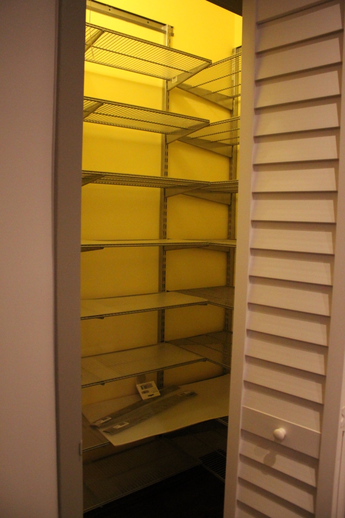
SO we tore it all out, and it looked like this:

The building, after much back and forth, would only let us take out part of the dividing wall. As you can see in the original photos, there is a horrendous yellow intercom/phone thing. To move it, we would have to re-route the wiring on our entire side of the building, which would have been super expensive. They’re planning on discontinuing the intercom system soon, though, so this wall is still temporary– we’ll knock it down when they give us the go-ahead.

In the photo above, you can see that we decided to drop the ceiling a few inches. Usually, this would be an odd decision in such a small, cave-like space, but for us it would allow lots of recessed lighting, and we weren’t actually losing any vertical space because of the oddly placed soffits. Originally, the dropped ceiling was only going to be in the part of the room that was the original kitchen, but once I saw it with the wall out, I knew we had to expand it to come out to where the new cabinets would end.

The elongated dropped ceiling plus the new slate-looking porcelain tiles made it finally feel like one continuous room (and not like we had Frankensteined together some kitchen contraption). And yes, we were two tiles short on the floor. Back to the Bronx for us.

The Ikea Fagerland cabinets were built and installed, and the appliances were delivered. The ceiling was also drywalled, giving us the first hints of what our new kitchen would look like.

One huge problem we encountered was what to do above the microwave. Ikea cabinets are great for the price, but for size selection they’re kind of lacking. There was no pre-set option at all that would have fit in this awkward 12×30″ space. All the short upper cabinets are at least 15″ tall, and there was no way that would work with the building vent. We toyed with the idea of “open concept”– basically attaching the microwave to a slab of wood and possibly putting up some decorative brackets. It looked terrible. Really really terrible. If the whole kitchen was open, it’d be fine, but it looked clearly unintentional and I couldn’t get over it.


Then one day I was chatting with the electrician, and I noticed that 12×30 looked kind of like the size of one of the cabinet doors. Lo and behold, the cabinet doors to the left of the sink were the exact size doors we needed! I ordered another door, and a 15×30 horizontal cabinet frame. When it arrived, the guys cut down the frame to just under 12″ and attached the door with a spiffy hinge mechanism that makes it defy gravity to stay open. The Ikea website calls it “Door lift with catch and gas damper” which is much more boring than my version.

It looks like Ikea may have discontinued this cabinet in the US, which is a shame because it’s awesome. Here‘s what it looks like in white, from the Canadian site.

Much better, right?

Here’s what it looks like open. It’s not a super functional cabinet because I can’t reach it or see inside, but it will probably hold lightbulbs or manuals or other things you don’t really need until you really do.

The next step was to pick the granite and have it installed. We decided to install the granite before picking a backsplash because we weren’t sure quite how dark it would look. Since we changed so much from the original kitchen (which was all white anyway), the wood cabinets and brown/black/green granite had the possibility of looking super cavernous. If it did, we would have done a colorful glass backsplash to reflect light. Otherwise, we were thinking slate tile to match the floor. (We ended up doing neither.)

The granite looked great, and the overhead and cabinet lights gave us tons of options for backsplashes.


IMG_2345

IMG_2282

This is was as far as we got before we moved in to the apartment and stopped the job for two months while we got married and went on a honeymoon road trip. It ended up being a blessing in disguise, though– the tiles I fell in love with were on pre-order when we left, and were delivered the day we got back!

And so we started up again– the guys almost had a heart attack when I showed them the curvy, complicated tile. For anyone else that orders this tile (full materials list at the bottom of the post), here’s a tip: take regular “+” shaped plastic spacers and cut them in half diagonally with a blade to make two “L” shaped pieces. You can place them in the right angled “corners” of the tile to get even spacing. Since the tiles were handmade, not every gap was exactly the same, but this way there was at least one constant, so it looked nice and neat. The photo above still has the spacers in, which you can see if you look closely.

I also had a mini-freakout about grout. I know, that’s so sad. But we had spent the entire day putting up the tile and didn’t know what color would look most natural. We discussed white, off-white, black, light gray, dark gray, sand, brown… there were too many contractors in the kitchen. Or cooks. Whatever. You know what I mean. Luckily, we live a few blocks from one of the only tile showrooms in Manhattan, so I took a tile and went alone to make the decision. I came back with a gray that was slightly lighter and warmer than the tile, but picked up the color of the low-glaze edges. Some contrast, but within the same color group. It was worth a try…

Yay! It looks so natural. At least I think so. M doesn’t really like it, but if he wants to re-grout the whole thing he’s welcome to.

Did I mention I did this? We ended up firing the tile guy (long story) about 20% of the way through, so the remainder of the grouting and caulking fell on me. Not that I mind– might as well put that Art School degree to a good use!

Here’s what it looks like when you zoom out. For some reason, I turned off the cabinet lights so it looks kind of dark, and the color balance is off. But the reason I’m posting it is to show that terrible vent! You know, the reason we needed to custom build cabinetry… now it’s a glaring white overpainted accessory in our otherwise glorious space. I went right out to good ol’ Home Depot and picked up a paint sample to help me match the tile color… at least it would be less glaring and white.

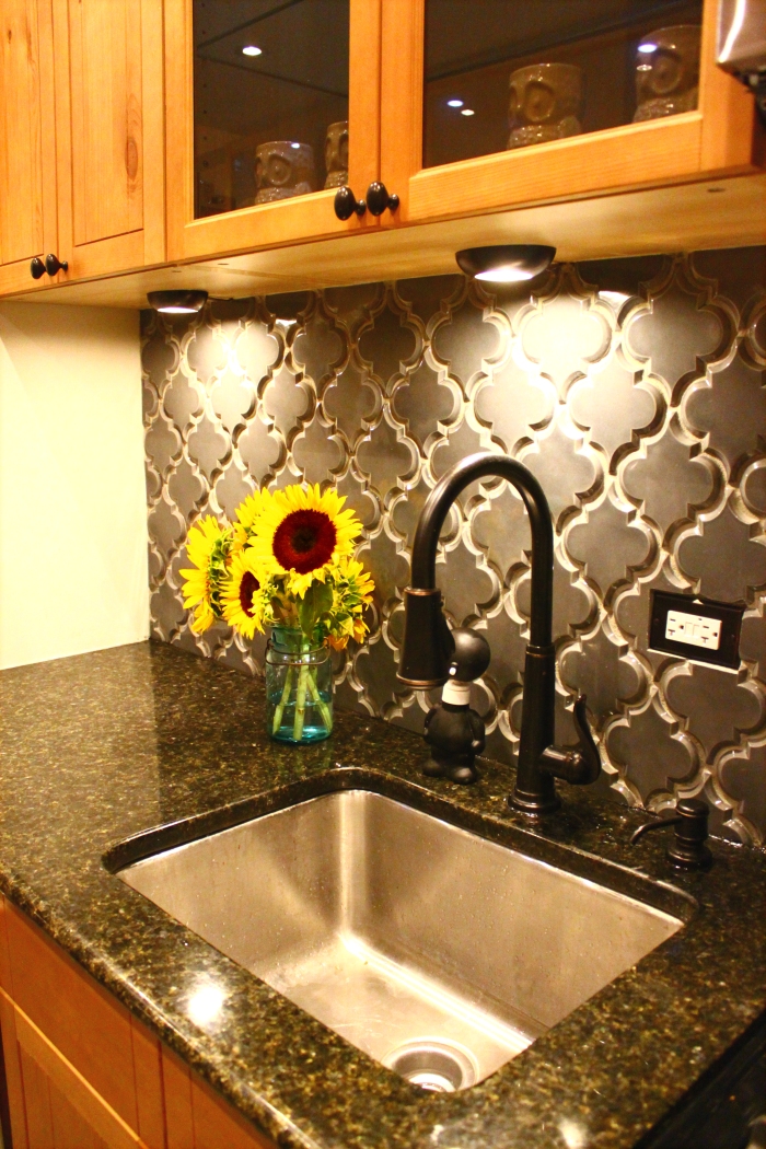
And, finally, here’s the final kitchen!!

Room Details:

β€’ Cabinets – Ikea Fagerland (discontinued), $3,500

β€’ Appliances – Frigidaire and Whirlpool from P.C. Richard, housewarming gift from my parents πŸ™‚

β€’ Countertops – Granite in “Uba Tuba” from Hindustan Granite in Brooklyn, $1,800

β€’ Floors – Slate-look Porcelain 12×12″ tile from Quality Tile in the Bronx, unsure of total price because we purchased the bathroom tile on the same invoice. If you go here, be ready to haggle! Ask for the “contractor price” and go from there.

β€’ Backsplash Beveled Arabesque Ceramic tile in “Up in Smoke” from Mission Stone & Tile, $700 with Apartment Therapy discount

β€’ HardwareGlacier Suite Cup Pulls and Knobs in Oil Rubbed Bronze from Lee Valley Tools, $160

β€’ HardwareVenetian Bronze Faceplates from handlesets.com

β€’ Paint – Behr 790C-2 “Silver Drop” with Eggshell Finish

β€’ Misc. – Undermount Sink, Recessed and Cabinet Lights, Ashfield Bronze Pull-Down Faucet from Home Depot, $900

Not bad, right? This has to be my favorite room in the house. Taking a two-month break, although enjoyable and relaxing, made me miss cooking more than I ever thought possible, and this kitchen brings all the joy back plus more– it’s by far the nicest kitchen I’ve ever had.

That being said,

Things I’d Do Differently (or Keep the Same):

If I were to start from scratch, with the same budget, I can’t think of much I’d change. I wish the tiles came at the same time as the granite, because it was a huge mess installing them while we were living in the space, but I couldn’t have changed that. I also probably would have gone with a brighter backsplash color– but I love the tile shape and it doesn’t come in a color I would have preferred.

The one thing I can’t stand is the LED lighting inside the cabinets. I chose them because they could be mounted on the surface and not stick out or have to be drilled in. They’re also super bright and they’re supposed to last forever. But the color is SO TERRIBLE. You can see in the photos– it’s bright blue. I’m planning on playing around with cellophane/spraypaint to see if I can craft together a solution, but right now they’re a major thumbs down.

I think the cabinets are beautiful and SO us, but I have a feeling they won’t be a selling point as much as I wish they were. They’re a little out of place in a New York co-op, but I knew what I was doing when I ordered them. I love them, and if the new tenants don’t, they can just switch out the doors. Ah, the glory of Ikea.

I also can’t wait until the building allows us to take out that left wall. M thinks it separates the space, but I think it’s a giant eyesore. Maybe when I’m done decorating and putting up hooks I’ll like it more, but right now I’m about to tear it down with my bare hands.

So there you have it! 6 months and one kitchen renovation later. Cheers!

The Sutton Apartment: Before

The first version of this post was originally posted in July 2011 on the giftable designs blog.

Welcome to our first place! It’s still full of the previous occupants’ hoarded belongings and needs a lot of work, but it’s in a full service building (with a laundry room! No more carrying 50 lbs of laundry a quarter mile every month!) and it’s in a nice neighborhood. When we walked in, we were stunned by its condition, but once we did the math and realized what good square footage it had, we were sold. It was in pretty shocking condition, but nothing a good ol’ renovation couldn’t fix!

Here is the series of snapshots I took the second time we walked in (I didn’t take any photos the first time because it was dark and I was too busy screaming and begging to leave). I’m also including a photo of some rooms once we got them cleaned out. If you get lost, the floorplan is in an old postΒ here.


[living room. worn down parquet floors, major spackling/sanding and window replacement needed. all the outlets are two-prong and painted over a hundred times.]

DSC02087
[kitchen. appliances, cabinets, and laminate countertops from 1953 (fridge replaced sometime in the 90’s). water damaged and roach infested. to us, this is the most important room, and there wasn’t much room to cook in the 7×7′ space. it looks a lot better than it actually was, believe me.]


[foyer- coat closet on left, kitchen straight ahead. became our kitchen extension by knocking down the right side and top of the wall.]


[dressing room. heavy wood sliding doors (on the left wall) were impossible to open and filthy.]


[bedroom. worn down parquet floors, major window replacement needed. broken closet doors, no functioning outlets.]


[bathroom. major water damage on all walls and ceiling. rusty tub full of bonus roaches (I didn’t include them in the closing docs but I guess they wanted to stay), outdated/broken fixtures. you can see the extent of the water damage in the bottom picture. thankfully it was all from a previous incident and dry when we got there.]


[all outlets were two-prong and painted over a hundred times.]


[windows. once we got all the old belongings cleared out, we realized there was condensation between the panes of glass. the building also required that we replace the window unit air conditioner with a through-the-wall unit (replacing the heater below). so that promised to be a super fun project!]

So there you have it. Obviously the renovation was a necessity. We closed on it in early December 2010, got all our approvals by late February 2011, and finished the bulk of it mid-May 2011. Each room posed its own challenges, so the next few posts will outline individual room renovations and final (renovated) photos. It’s amazing what you can do with this many blank, white walls!

❀ v