Because it isn’t just as easy as picking out a color and waiting for the “after” photos, I’m going to start outlining each room, the process of design and renovation, and finally what I would change (or wouldn’t) if given the chance. I’m going to upload a ton of pictures with little descriptions, but if you just want the final run-down (or the finished pictures!), scroll to the bottom.
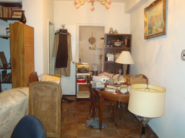
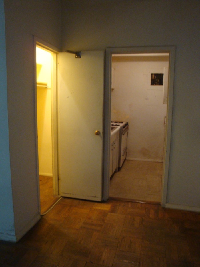
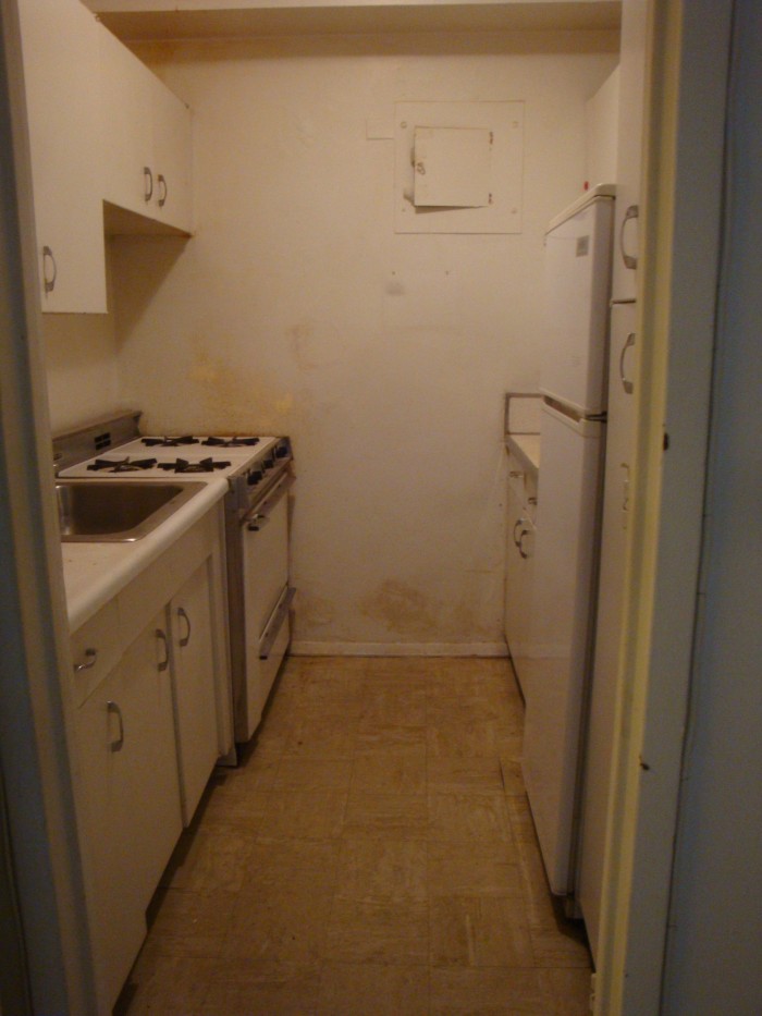
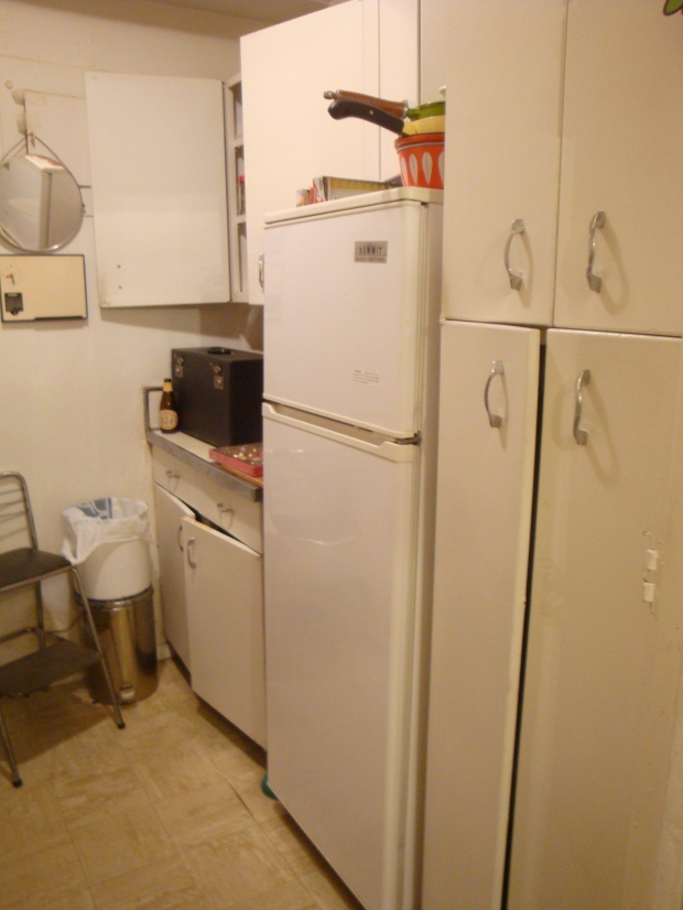
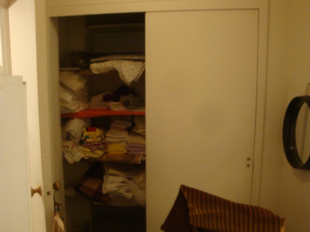
When we first saw our new apartment, this is what the kitchen/foyer looked like:
Eek, right?
Personally, I probably might have kept the antique metal cabinets if they were in decent condition.
BUT
• They weren’t– none of them closed, the enamel was in disrepair, and the insides were disgusting. I never would have wanted to keep food in the place I knew was once coated in mouse poo.
• The cabinet layout made no sense. There was no place that we could have put a dishwasher, and the gaps in the cabinets allowed for a huge 36″ stove but only a mini refrigerator (I didn’t measure it, but it’s definitely beyond apartment-sized).
• We wanted to expand the kitchen, and never would have found matching ones.
• They didn’t even go close to the ceiling, leaving a 10″ space that I couldn’t access without a step-stool. It would just end up dusty and unused.
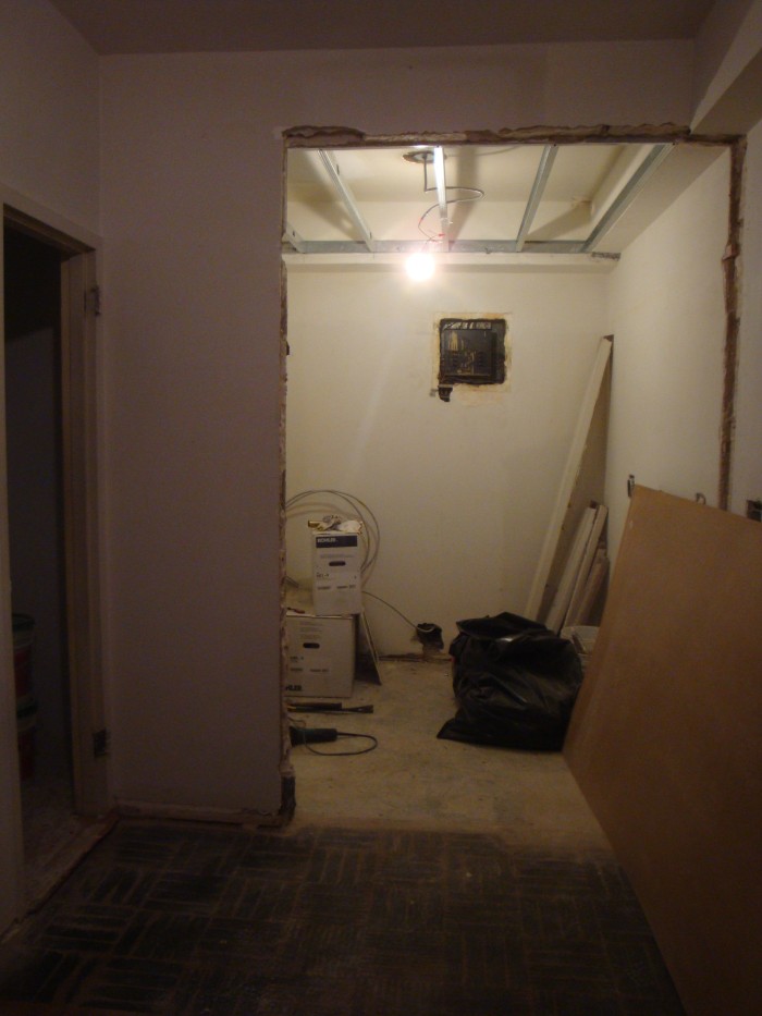
SO we tore it all out, and it looked like this:
The building, after much back and forth, would only let us take out part of the dividing wall. As you can see in the original photos, there is a horrendous yellow intercom/phone thing. To move it, we would have to re-route the wiring on our entire side of the building, which would have been super expensive. They’re planning on discontinuing the intercom system soon, though, so this wall is still temporary– we’ll knock it down when they give us the go-ahead.
In the photo above, you can see that we decided to drop the ceiling a few inches. Usually, this would be an odd decision in such a small, cave-like space, but for us it would allow lots of recessed lighting, and we weren’t actually losing any vertical space because of the oddly placed soffits. Originally, the dropped ceiling was only going to be in the part of the room that was the original kitchen, but once I saw it with the wall out, I knew we had to expand it to come out to where the new cabinets would end.
The elongated dropped ceiling plus the new slate-looking porcelain tiles made it finally feel like one continuous room (and not like we had Frankensteined together some kitchen contraption). And yes, we were two tiles short on the floor. Back to the Bronx for us.
The Ikea Fagerland cabinets were built and installed, and the appliances were delivered. The ceiling was also drywalled, giving us the first hints of what our new kitchen would look like.
One huge problem we encountered was what to do above the microwave. Ikea cabinets are great for the price, but for size selection they’re kind of lacking. There was no pre-set option at all that would have fit in this awkward 12×30″ space. All the short upper cabinets are at least 15″ tall, and there was no way that would work with the building vent. We toyed with the idea of “open concept”– basically attaching the microwave to a slab of wood and possibly putting up some decorative brackets. It looked terrible. Really really terrible. If the whole kitchen was open, it’d be fine, but it looked clearly unintentional and I couldn’t get over it.
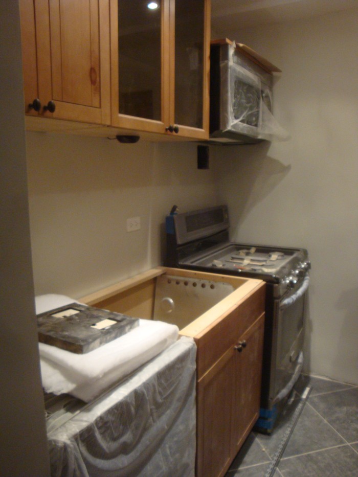
Then one day I was chatting with the electrician, and I noticed that 12×30 looked kind of like the size of one of the cabinet doors. Lo and behold, the cabinet doors to the left of the sink were the exact size doors we needed! I ordered another door, and a 15×30 horizontal cabinet frame. When it arrived, the guys cut down the frame to just under 12″ and attached the door with a spiffy hinge mechanism that makes it defy gravity to stay open. The Ikea website calls it “Door lift with catch and gas damper” which is much more boring than my version.
It looks like Ikea may have discontinued this cabinet in the US, which is a shame because it’s awesome. Here‘s what it looks like in white, from the Canadian site.
 Here’s what it looks like open. It’s not a super functional cabinet because I can’t reach it or see inside, but it will probably hold lightbulbs or manuals or other things you don’t really need until you really do.
The next step was to pick the granite and have it installed. We decided to install the granite before picking a backsplash because we weren’t sure quite how dark it would look. Since we changed so much from the original kitchen (which was all white anyway), the wood cabinets and brown/black/green granite had the possibility of looking super cavernous. If it did, we would have done a colorful glass backsplash to reflect light. Otherwise, we were thinking slate tile to match the floor. (We ended up doing neither.)
The granite looked great, and the overhead and cabinet lights gave us tons of options for backsplashes.
This is was as far as we got before we moved in to the apartment and stopped the job for two months while we got married and went on a honeymoon road trip. It ended up being a blessing in disguise, though– the tiles I fell in love with were on pre-order when we left, and were delivered the day we got back!
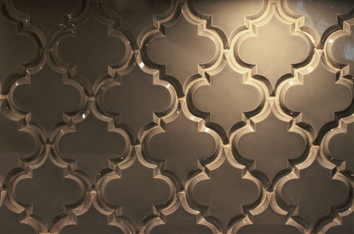
And so we started up again– the guys almost had a heart attack when I showed them the curvy, complicated tile. For anyone else that orders this tile (full materials list at the bottom of the post), here’s a tip: take regular “+” shaped plastic spacers and cut them in half diagonally with a blade to make two “L” shaped pieces. You can place them in the right angled “corners” of the tile to get even spacing. Since the tiles were handmade, not every gap was exactly the same, but this way there was at least one constant, so it looked nice and neat. The photo above still has the spacers in, which you can see if you look closely.
I also had a mini-freakout about grout. I know, that’s so sad. But we had spent the entire day putting up the tile and didn’t know what color would look most natural. We discussed white, off-white, black, light gray, dark gray, sand, brown… there were too many contractors in the kitchen. Or cooks. Whatever. You know what I mean. Luckily, we live a few blocks from one of the only tile showrooms in Manhattan, so I took a tile and went alone to make the decision. I came back with a gray that was slightly lighter and warmer than the tile, but picked up the color of the low-glaze edges. Some contrast, but within the same color group. It was worth a try…
Yay! It looks so natural. At least I think so. M doesn’t really like it, but if he wants to re-grout the whole thing he’s welcome to.
Did I mention I did this? We ended up firing the tile guy (long story) about 20% of the way through, so the remainder of the grouting and caulking fell on me. Not that I mind– might as well put that Art School degree to a good use!
Here’s what it looks like when you zoom out. For some reason, I turned off the cabinet lights so it looks kind of dark, and the color balance is off. But the reason I’m posting it is to show that terrible vent! You know, the reason we needed to custom build cabinetry… now it’s a glaring white overpainted accessory in our otherwise glorious space. I went right out to good ol’ Home Depot and picked up a paint sample to help me match the tile color… at least it would be less glaring and white.
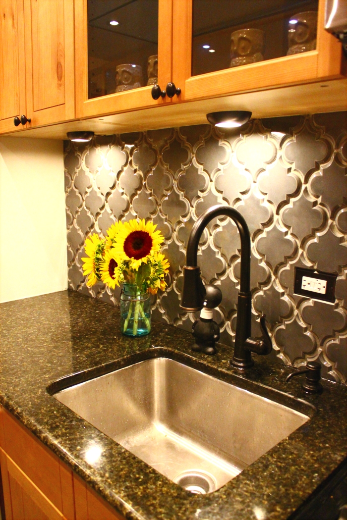
And, finally, here’s the final kitchen!!
Room Details:
• Cabinets – Ikea Fagerland (discontinued), $3,500
• Appliances – Frigidaire and Whirlpool from P.C. Richard, housewarming gift from my parents 🙂
• Countertops – Granite in “Uba Tuba” from Hindustan Granite in Brooklyn, $1,800
• Floors – Slate-look Porcelain 12×12″ tile from Quality Tile in the Bronx, unsure of total price because we purchased the bathroom tile on the same invoice. If you go here, be ready to haggle! Ask for the “contractor price” and go from there.
• Backsplash – Beveled Arabesque Ceramic tile in “Up in Smoke” from Mission Stone & Tile, $700 with Apartment Therapy discount
• Hardware – Glacier Suite Cup Pulls and Knobs in Oil Rubbed Bronze from Lee Valley Tools, $160
• Hardware – Venetian Bronze Faceplates from handlesets.com
• Paint – Behr 790C-2 “Silver Drop” with Eggshell Finish
• Misc. – Undermount Sink, Recessed and Cabinet Lights, Ashfield Bronze Pull-Down Faucet from Home Depot, $900
Not bad, right? This has to be my favorite room in the house. Taking a two-month break, although enjoyable and relaxing, made me miss cooking more than I ever thought possible, and this kitchen brings all the joy back plus more– it’s by far the nicest kitchen I’ve ever had.
That being said,
Things I’d Do Differently (or Keep the Same):
If I were to start from scratch, with the same budget, I can’t think of much I’d change. I wish the tiles came at the same time as the granite, because it was a huge mess installing them while we were living in the space, but I couldn’t have changed that. I also probably would have gone with a brighter backsplash color– but I love the tile shape and it doesn’t come in a color I would have preferred.
The one thing I can’t stand is the LED lighting inside the cabinets. I chose them because they could be mounted on the surface and not stick out or have to be drilled in. They’re also super bright and they’re supposed to last forever. But the color is SO TERRIBLE. You can see in the photos– it’s bright blue. I’m planning on playing around with cellophane/spraypaint to see if I can craft together a solution, but right now they’re a major thumbs down.
I think the cabinets are beautiful and SO us, but I have a feeling they won’t be a selling point as much as I wish they were. They’re a little out of place in a New York co-op, but I knew what I was doing when I ordered them. I love them, and if the new tenants don’t, they can just switch out the doors. Ah, the glory of Ikea.
I also can’t wait until the building allows us to take out that left wall. M thinks it separates the space, but I think it’s a giant eyesore. Maybe when I’m done decorating and putting up hooks I’ll like it more, but right now I’m about to tear it down with my bare hands.
So there you have it! 6 months and one kitchen renovation later. Cheers!
